Red Bird Pizza - Case Study
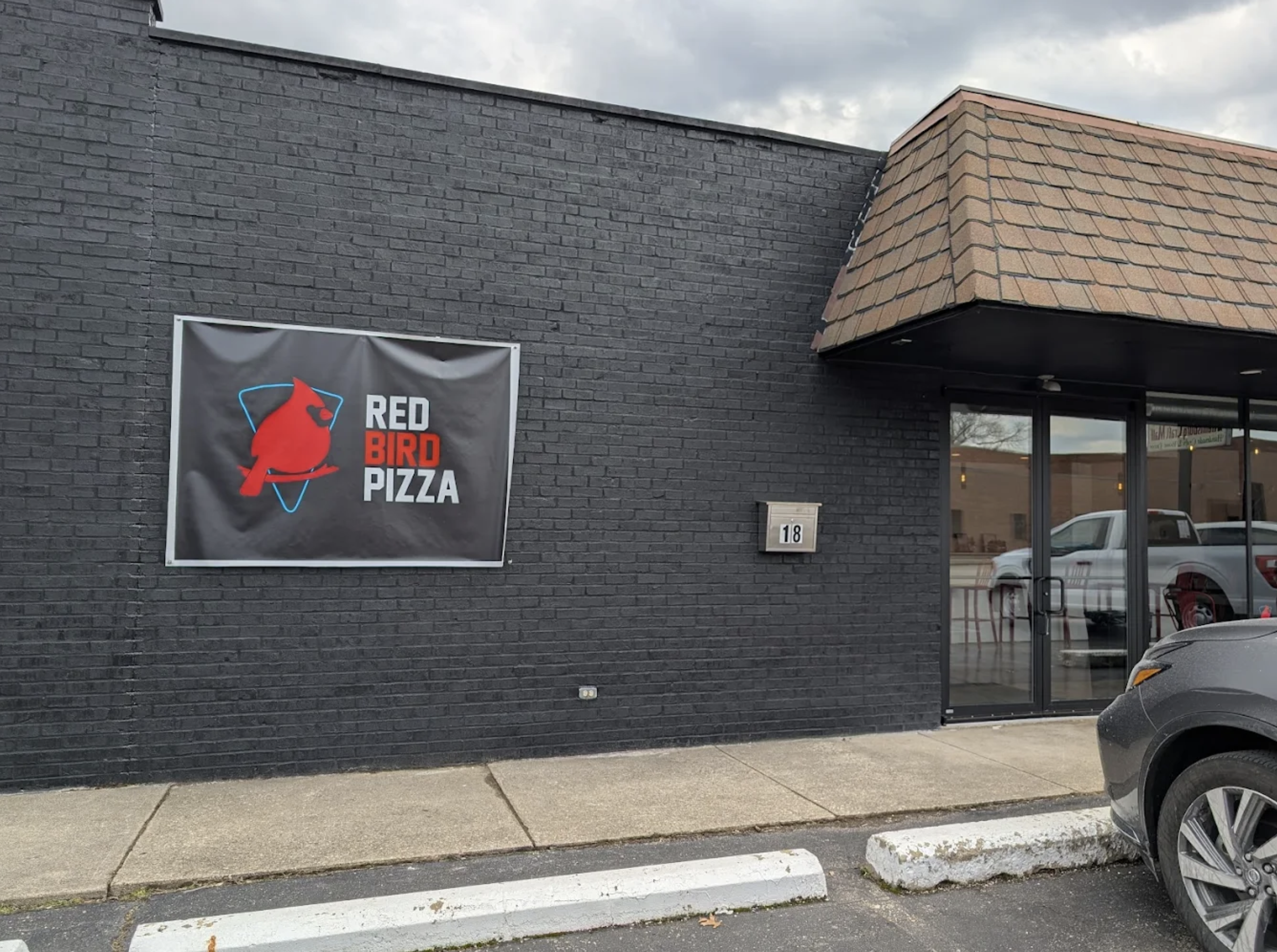
Red Bird Pizza is a neighborhood pizzeria that brings New York–style pizza to the Midwest, blending authentic flavor with local pride and community connection. While their food and mission were strong, their brand identity didn’t match the bold, flavorful experience they delivered. The goal of this project was to modernize Red Bird’s visual identity while keeping the grit and character of its roots.
Red Bird had the taste, the story, and the community love, but not a strong brand system. Their visuals lacked consistency across digital, print, and in-store applications.
The design direction was inspired by the nostalgia of classic New York pizza joints mixed with a bold, modern edge. I paired Bungee, a chunky display font reminiscent of NYC street signage, with Inter, a clean and highly readable sans serif, to strike a balance between personality and clarity. A palette of black, red, and cream provided high-contrast energy, keeping the brand bold but approachable. The overall tone was designed to feel cheeky, confident, and proud — much like a slice of pizza that speaks for itself.
My objective was to refresh the brand for a younger, design-conscious audience, maintain authenticity for longtime locals, and create a cohesive system that could stretch across menus, merchandise, packaging, and digital platforms.

The logo became the centerpiece of the new identity, and I wanted something iconic — bold, fun, and full of attitude — while instantly recognizable as Red Bird. I began with rough sketches of cardinals inspired by vintage cartoons and sports mascots.
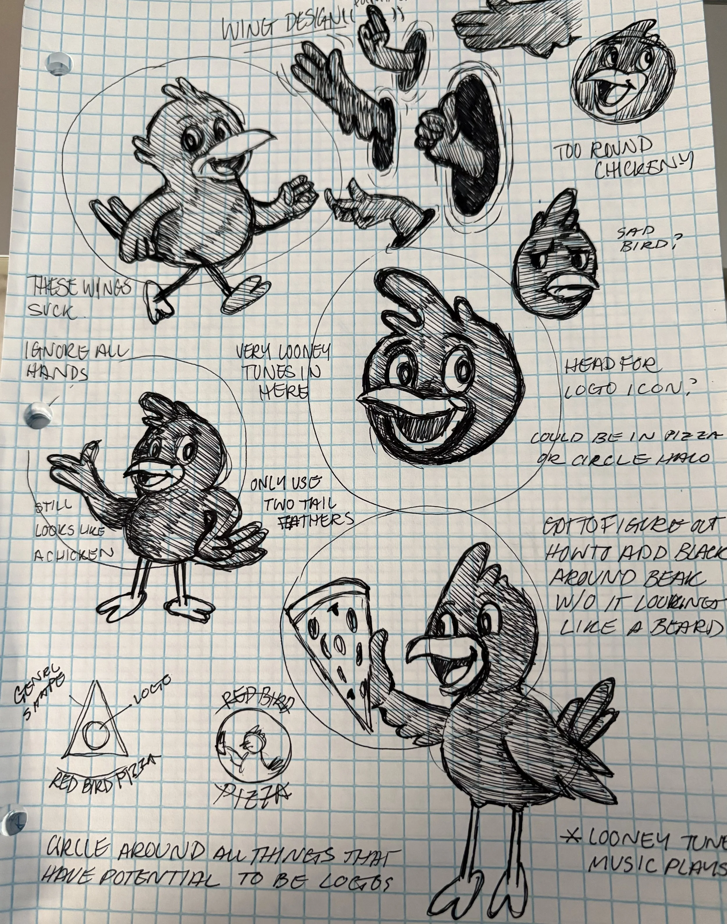
The challenge was finding the right balance between playful and tough, creating a mascot that could work equally well on a pizza box, a t-shirt, or a storefront sign.
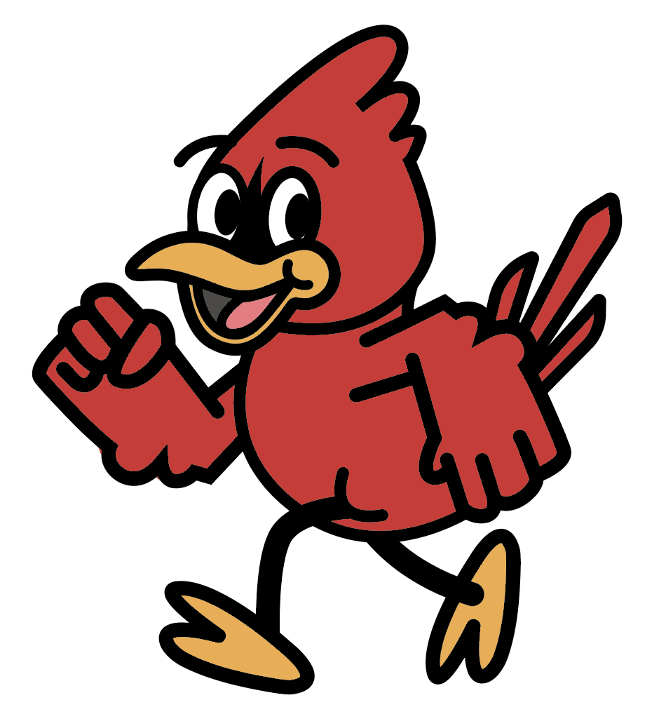
From those sketches, I simplified the forms, reducing them to thick lines and bold shapes that gave the bird a retro illustrated style without losing modern flexibility.
As I refined the design, I paid special attention to the expression, pushing it toward a mischievous and cheeky personality that reflected the brand’s voice. The eyes and beak became defining features, allowing the mascot to carry personality even at small sizes.
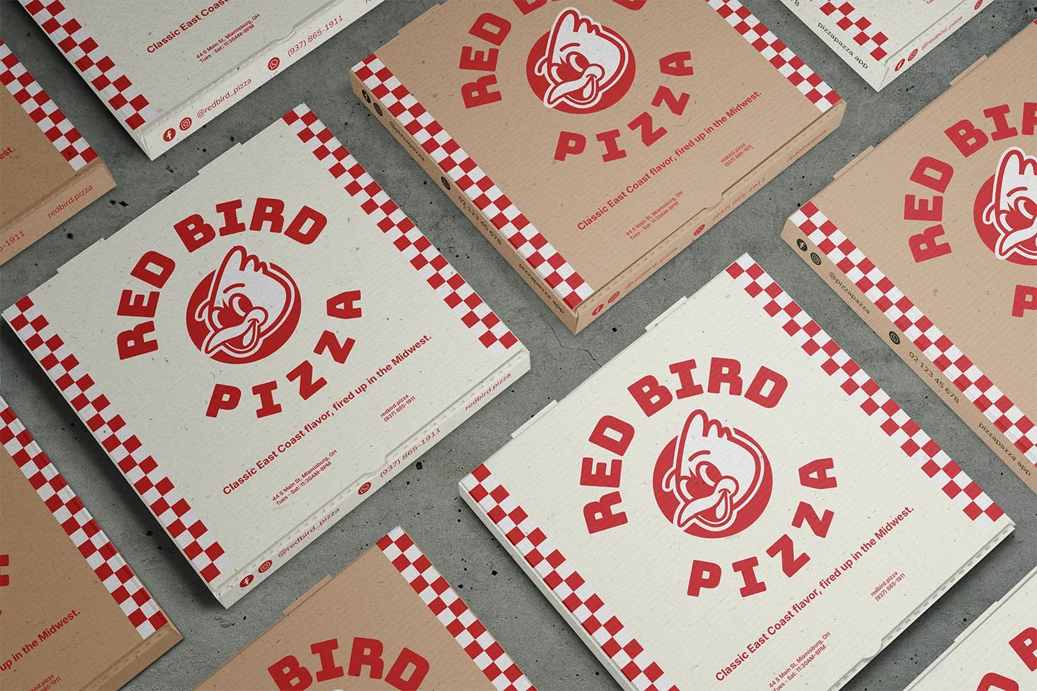
To make the system more adaptable, I designed three versions of the logo: a full wordmark with the mascot for menus and signage, a circular lockup for packaging and stickers, and a standalone mascot for merch and digital uses. By building this range of lockups, I gave Red Bird Pizza a toolkit of marks instead of a single static logo, ensuring flexibility across all touchpoints without losing consistency.
Once the logo system was established, I expanded it into a full set of deliverables.
The website homepage introduces Red Bird with bold typography, food photography, and a playful voice that captures the brand’s personality.
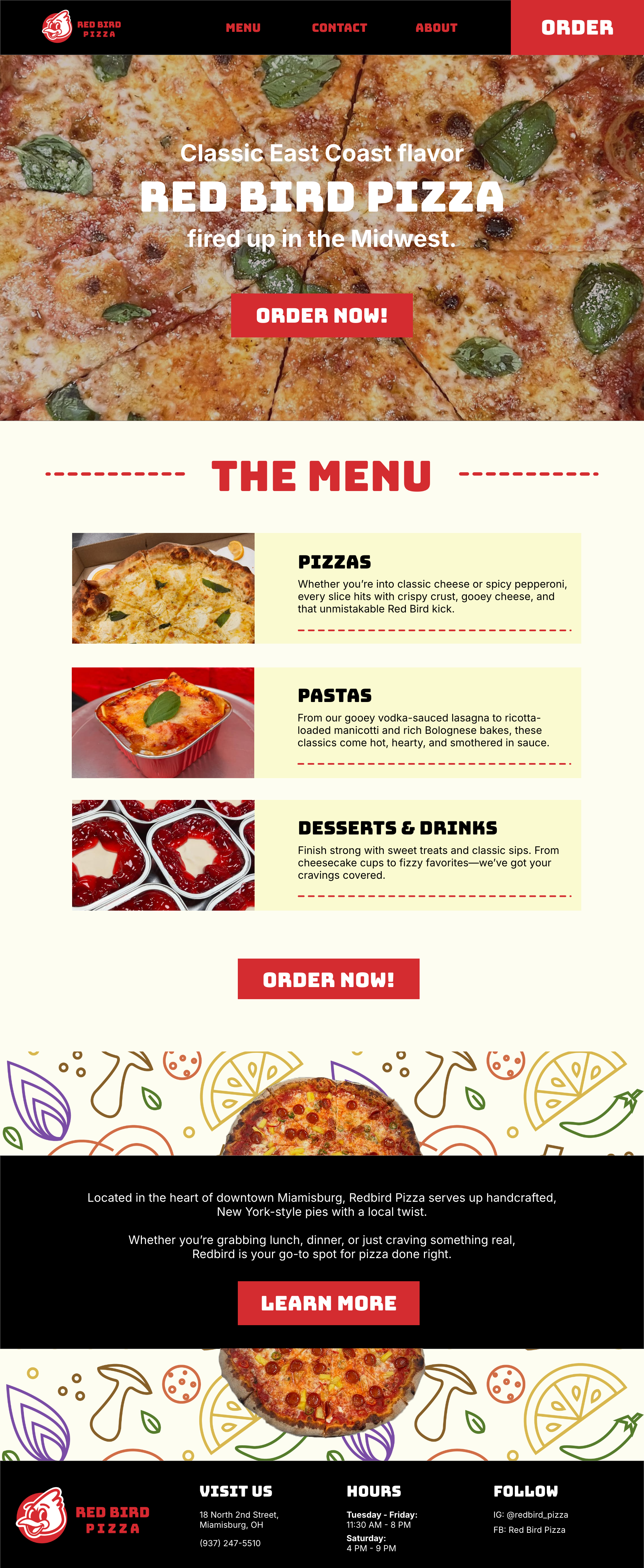


The menu balances clear readability with bold section headers, making it easy for customers to find their favorites while keeping the layout craveable.
For packaging, I designed a pizza box that puts the circular logo front and center, accented by repeating patterns and strong type for instant recognition.

I also created a t-shirt design that draws on the mascot and system graphics for a streetwear-inspired look, transforming staff and customers into walking brand ambassadors.
This project pushed me to think about design as a cohesive system rather than a set of separate pieces.
The logo process reminded me how much personality can live inside a mascot — when expressive and well-crafted, it becomes more than a decoration, it becomes the voice of the brand. Red Bird Pizza ultimately taught me how to make something feel both familiar and fresh. The brand needed to resonate with a younger, design-savvy audience while staying true to its small-town authenticity. That balance of grit and polish became the heartbeat of the identity, and it’s what I am most proud of in this project.