Marco’s Paper - Presentation Project
Marco’s Paper & Crafts has been a local staple since 1971, known for its wide selection of specialty papers, crafting supplies, and the cozy, nostalgic experience customers feel when they walk in. While its reputation and loyal customer base were strong, the brand’s visuals and marketing lacked the consistency and modern appeal needed to reach younger audiences.
Our goal, as a group, with this project was to reintroduce Marco’s as both a trusted creative hub and a refreshed, design-forward brand that could bridge generations of makers.
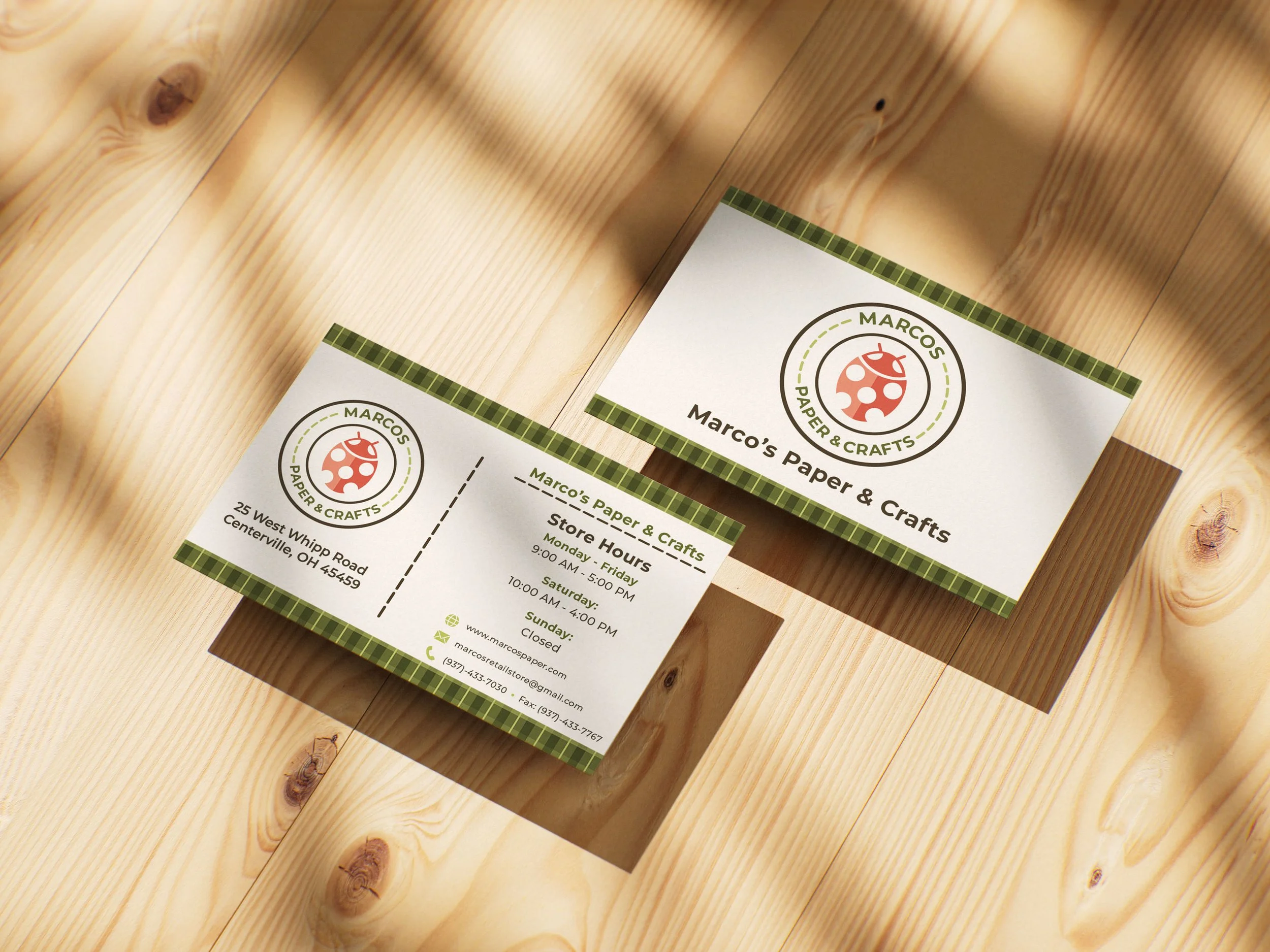
As Creative Director and Print Lead, my role was to translate our campaign strategy into a system of print assets that felt both timeless and trend-driven.
Research showed that Marco’s had two distinct audiences: longtime paper lovers who valued warmth and tradition, and younger adults drawn to DIY projects, scrapbooking, and visual storytelling. I set out to design print that honored Marco’s roots while giving it a scrapbook-inspired, modern aesthetic that would connect with new crafters.
The design direction leaned into textures, layering, and tactile details that celebrated the spirit of paper itself. A palette of soft, earthy tones — cream, sage green, dusty blue, and light brown — gave the campaign warmth and approachability, while still feeling current.

Typography paired classic serifs for tradition with handwritten-inspired sans serifs for personality, creating contrast and depth.
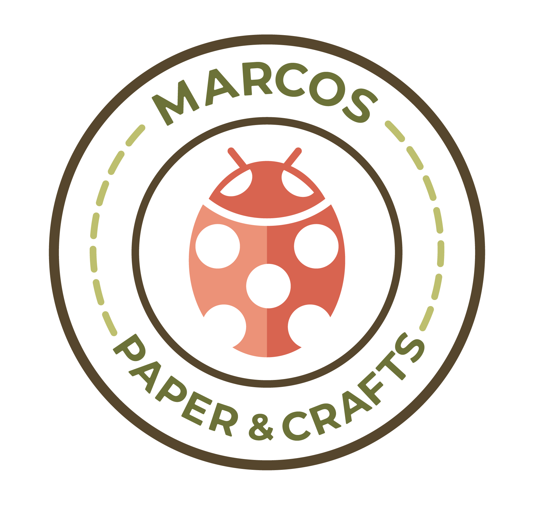
We also carried forward subtle brand details like the ladybug, a nod to Marco’s history, using it as a small accent rather than a mascot to keep the identity grounded in its past without feeling dated.


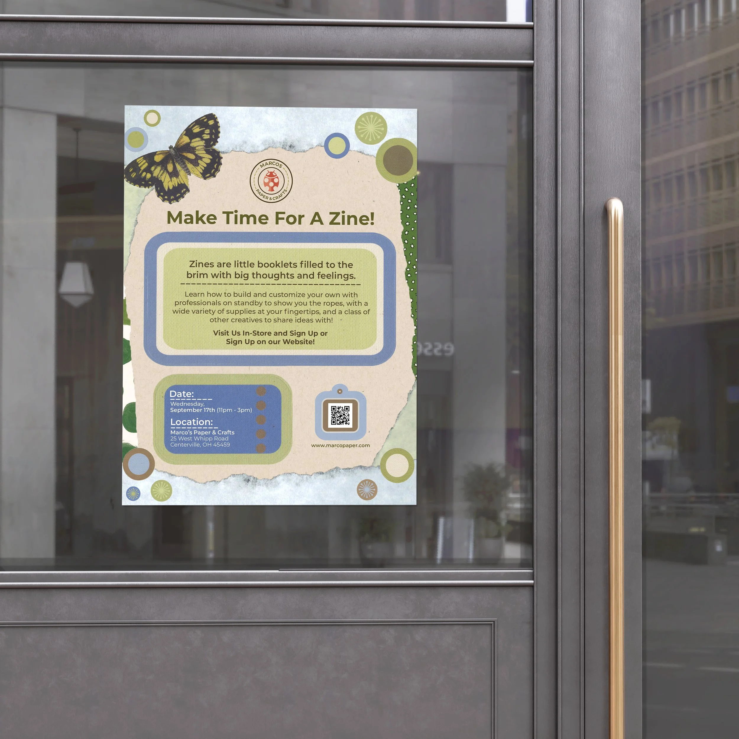
From this foundation, we created a series of posters, flyers, and event signage that embodied the campaign’s storytelling theme. The “Start Your Story!” poster invited both newcomers and seasoned scrapbookers to explore memory-making through beginner-friendly kits, while the “Make Time for a Zine!” poster promoted a hands-on zine workshop, using brighter greens and playful copy to appeal to curious creatives.
Each print piece incorporated collage textures, butterfly motifs, and QR codes for digital integration, reinforcing the brand’s blend of tactile and modern touchpoints.

The final system of print assets became a cornerstone of the rebrand, grounding Marco’s refreshed identity in something physical and enduring. More than just promotional materials, the designs told a story — one that encouraged customers to slow down, create with intention, and connect with the emotional experience of crafting.